GALXE
Samuel knew exactly what the GALXE visual identity end goal was and through research, planning, mood boarding, playlist sharing, got there together
SCOPE - Logo Design
LET’S GET STARTED
Working with a client like Samuel is every designer’s dream. We hit it off right away and worked over the course of a few months to land on a final visual identity which included logos, secondary logos/badges, social banners and more projects to come!
DIRECTION
On our intro call, Samuel brought up words such as clean, dark, moody and sexy. We both IMMEDIATELY knew that the direction of this logo was going to lean to the Y2K style. He already had some graphics created that we could play off of that included wireframe graphics and the globe iconography.
EXPLORATION
Drooling at the mouth with a blank sketchbook open, I got to work. Samuel wanted a logo that fit the sound of his mixes. Dark. Moody. Sexy. Below, you’ll find some examples of what we came up with in round one.
DARK
|
MOODY
|
SEXY
|
DARK | MOODY | SEXY |


ROUND 2
After speaking with Samuel, we combined some of the ideas together to create something a bit more cohesive and within Samuel’s vision.
![GALXE Concepts [Round 2].png](https://images.squarespace-cdn.com/content/v1/62f2b38e575c673bcfc6dcba/2ead80c8-862f-412e-b34f-e90c8166b6d6/GALXE+Concepts+%5BRound+2%5D.png)
![GALXE Concepts [Round 2]-37.png](https://images.squarespace-cdn.com/content/v1/62f2b38e575c673bcfc6dcba/e21ca557-8de0-47f4-b52d-31c332890460/GALXE+Concepts+%5BRound+2%5D-37.png)
![GALXE Concepts [Round 2]-39.png](https://images.squarespace-cdn.com/content/v1/62f2b38e575c673bcfc6dcba/e88e0cd6-3efd-488c-b3a3-ae42e48840de/GALXE+Concepts+%5BRound+2%5D-39.png)
![GALXE Concepts [Round 2]-27.png](https://images.squarespace-cdn.com/content/v1/62f2b38e575c673bcfc6dcba/4f948c3a-ddb5-4f87-bc73-47e1273e4c62/GALXE+Concepts+%5BRound+2%5D-27.png)
![GALXE Concepts [Round 2]-25.png](https://images.squarespace-cdn.com/content/v1/62f2b38e575c673bcfc6dcba/6ca32dc6-c02c-4965-bd92-73ffc72ca66e/GALXE+Concepts+%5BRound+2%5D-25.png)
![GALXE Concepts [Round 2]-21.png](https://images.squarespace-cdn.com/content/v1/62f2b38e575c673bcfc6dcba/6cbe0b38-4f9d-4e94-bf2e-9e69a7d89e11/GALXE+Concepts+%5BRound+2%5D-21.png)
![GALXE Concepts [Round 2]-17.png](https://images.squarespace-cdn.com/content/v1/62f2b38e575c673bcfc6dcba/10620353-4e1f-486d-a412-fa325d49072d/GALXE+Concepts+%5BRound+2%5D-17.png)
![GALXE Concepts [Round 2]-15.png](https://images.squarespace-cdn.com/content/v1/62f2b38e575c673bcfc6dcba/12c51f11-573d-48ba-9897-c0f8c4aa9682/GALXE+Concepts+%5BRound+2%5D-15.png)
![GALXE Concepts [Round 2]-11.png](https://images.squarespace-cdn.com/content/v1/62f2b38e575c673bcfc6dcba/0bc08e96-a0e9-4bd6-afe2-ac9739ba9108/GALXE+Concepts+%5BRound+2%5D-11.png)
![GALXE Concepts [Round 2]-01.png](https://images.squarespace-cdn.com/content/v1/62f2b38e575c673bcfc6dcba/7afdf08d-d9dc-480a-9b39-ab57d4f02994/GALXE+Concepts+%5BRound+2%5D-01.png)
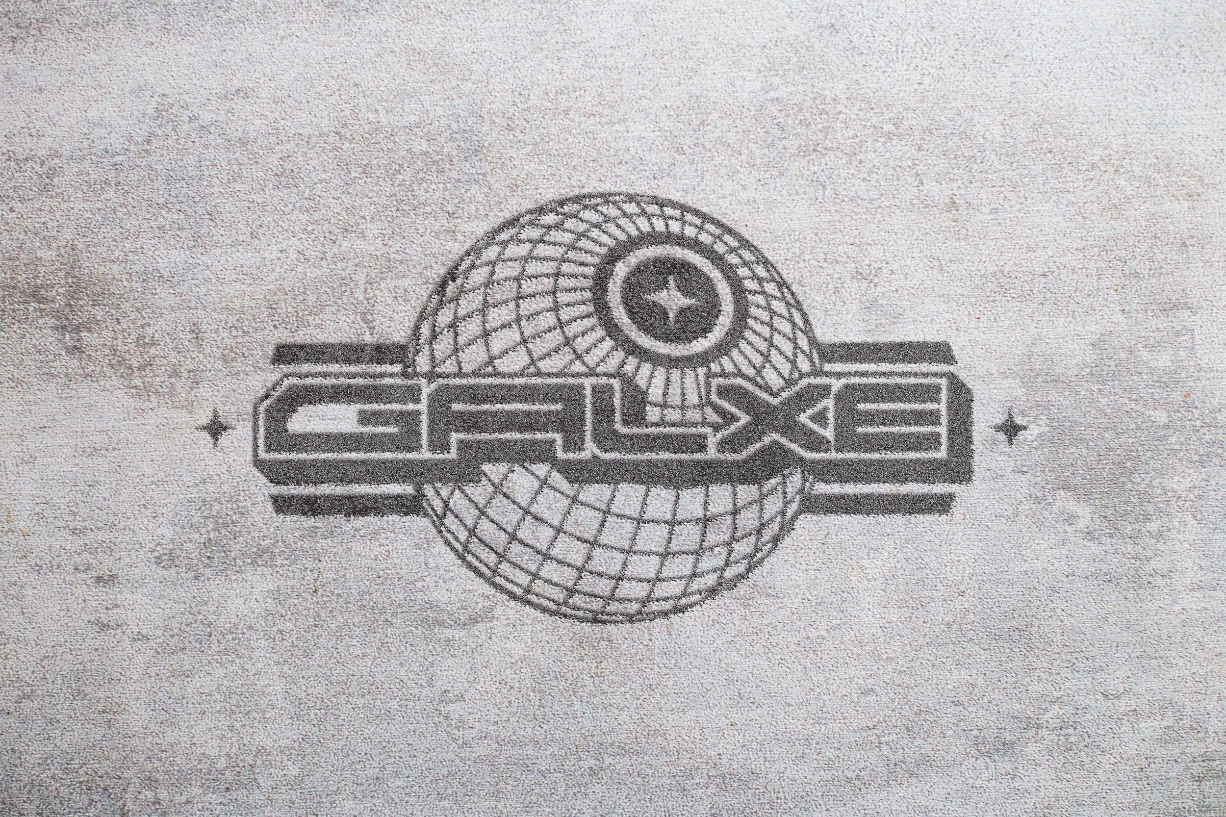
FINAL
This round helped us get to the final, which Samuel couldn’t have been more happy about… I wasn’t too mad with the results either. 😉
Combining multiple different ideas from the rounds prior, this was our final. Below are the secondary logos to accompany.