HIGH WATER FARMS
Working with Kelly and Lee was an awesome experience, they knew exactly what they wanted and made their vision and their business needs very clear.
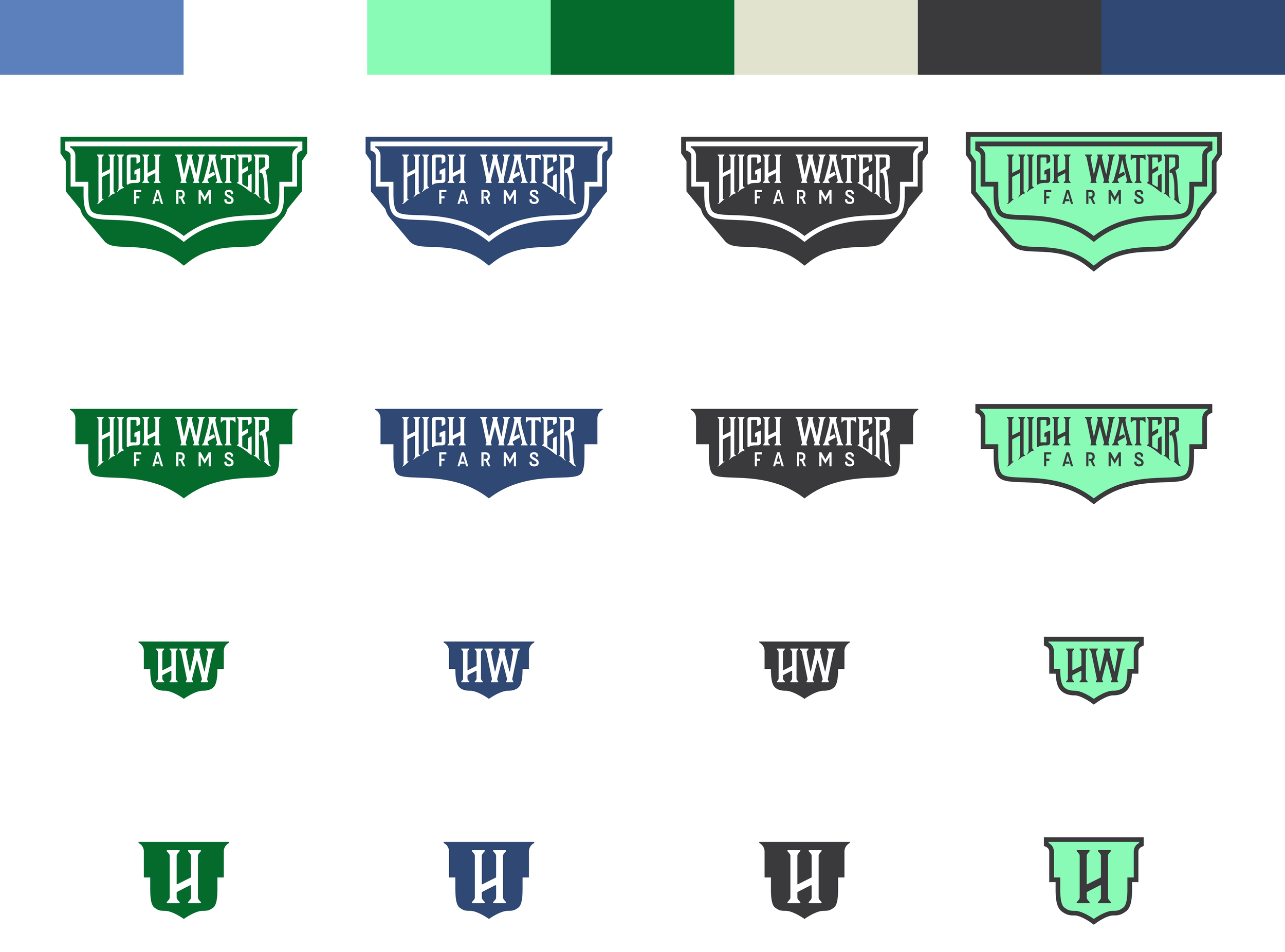
SCOPE - Logo Design
LET’S GET STARTED
Every good branding project starts with talking. We hopped on the phone with Kelly so we could learn a bit more about High Water Farms. They’re a hay farm based out of Northeast Ohio that specializes in hay for high-end horse owners and farmers. They want to build a brand that is separate from their name to help push the business further.
DIRECTION
We decided the best route was to go with something clean, simple and classic. Kelly was sure to let us know that avoiding the typical “rustic” and “modern farmhouse” looks were a no go. That was a great thing to hear.
EXPLORATION
As a logo designer, you don’t assume that you’ll be watching YouTube videos on how hay is made but, not gonna lie, it was pretty interesting. A few videos, 10ish pages of sketching, and multiple design files later, it felt like there were some good options to show.
CLEAN
|
SIMPLE
|
CLASSIC
|
CLEAN | SIMPLE | CLASSIC |


PRESENTATION
We were pretty happy with the round of logos we produced but after the call got pushed back a few days, we couldn’t help but work on it more. After all, we do actually enjoy working on these logos! That’s when THE logo was created.
Presenting this logo was such a cool moment as we knew it was “the one” once it was created, but Kelly and Lee immediately knew it too. There are some good logos in the first batch above, but we all agreed this was it.

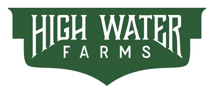


FINAL RESULTS
After a few more tweaks and color adjustments, we were ready to send over the final files. Kelly and Lee had the great idea of adjusting the green to be similar to the color of the tractor brand that’s been prevalent on the farm. Tying it back to something of meaning like that was a great choice on their end. We couldn’t have asked for a better team to work with!