

Chasma Sound
About
Jordan approached me with the need to create a visual identity for his side hustle/creative outlet, Chasma Sound. My first reaction was, “wow I’m honored,” and then I headed to SoundCloud to check out his work, to which I found the most ethereal soundscapes I’ve ever heard. Jordan’s sound was clean, ambient, and incredible.
I was excited to get to work.
Scope
Visual Identity - The typical items when you think of branding. A logo, badges, color palette, typography, etc.
Logo Animation - Something that would perfectly accompany his shows on screen.
Thought Process
As I mentioned earlier, Kate had a strong idea of how this brand would look, so the process was more about asking strategic questions to get a solid final result.
We reviewed hundreds of script fonts, dozens of color palettes and referred back to the mood board we created on a nightly basis.
Through this process, we knew social media and print would be the two main places this logo would live. This affects how the logo should scale and how the colors complement one another.


The Logo
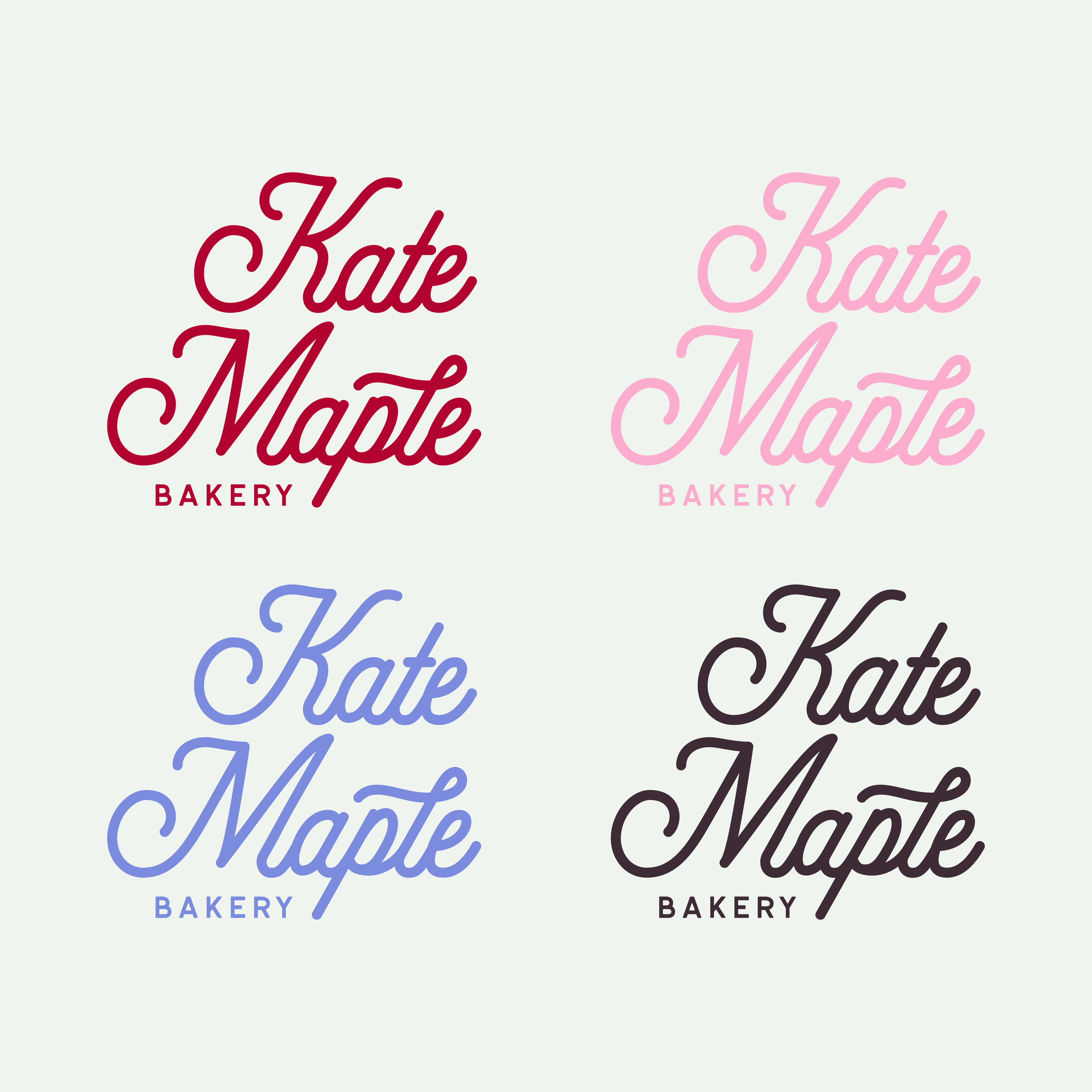
The Kate Maple mark is legible, versatile, memorable, unique, scaleable and cohesive. These are the requirements of a good logo and logo system.
One challenge that we faced was the color pink. As mentioned earlier, the hex codes may as well have been written out for me. With that being said, pink on white is not the most legible/accessible color combo. With this in mind, we incorporated a red that works very well with the bakery box pink. These colors can be layered together to make sure all can read and recognize the Kate Maple look.
Another challenge we faced was the word bakery. Should the logo read “gluten-free bakery,” or read “bakery” only? To find our answer, we thought about the real-world process of how people will interact with Kate’s product. They’ll be at farmers’ and flea markets, inquiring on social media and picking it up from the home basket location. We decided Kate herself, as well as the marketing, could handle informing and teaching people the wonders of gluten-free baking. This would give her a good opportunity to connect with her customers on a deeper level and build trust in her brand. We also included a version with a vintage badge that states these goods are ”Always Gluten-Free” for instances where it makes sense.

Final Thoughts
I couldn't be happier with how this logo turned out. The logo fits perfectly on the print applications we've created so far, and I'm excited to see where else this logo lives, as well as how Kate's business evolves.
